
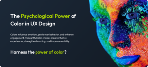
Imagine walking into a room painted entirely in bright red. How do you feel? Excited? Anxious? Or maybe ready to burst into a spontaneous dance battle? Now, step into a cool blue room—calm, serene, and perhaps even a little sleepy, right? That, my friend, is Color Psychology in UX at work, and it’s no joke. Colors do more than please the eye—they play mind games with us, shaping how we feel, think, and behave.
So, grab your favorite cup of coffee (or tea if you’re feeling green today), and let’s explore how color psychology influences user experience (UX). By the end, you’ll understand why choosing the right UI color choices is as important as selecting the right features for your app or website.
Why Is Color Psychology So Powerful in UX?
Let’s start with a little riddle: I’m a quiet communicator. I influence your mood, your trust, and even your spending habits. What am I? You guessed it—color.
Colors tap into our subconscious minds, triggering emotional and psychological responses. Whether it’s the soothing calm of a pastel green or the urgency of a bright orange “Buy Now” button, colors guide users’ actions and decisions. In Color Psychology in UX, understanding this impact can mean the difference between a product that’s loved and one that’s left.
The Connection Between Color and Emotions
Colors are more than just pretty visuals—they carry emotional weight. Think of it as an emotional color palette that speaks directly to your users’ feelings. Here’s a quick crash course:
- Red: Passion, excitement, urgency. Great for sales but can also signal danger.
- Blue: Trust, reliability, calmness. Often used in finance and healthcare.
- Yellow: Happiness, optimism, energy. Be careful, though—it can also trigger caution.
- Green: Growth, harmony, wealth. Ideal for eco-friendly or health-focused brands.
- Purple: Creativity, luxury, mystery. Perfect for premium or artistic brands.
- Black: Power, sophistication, elegance. Frequently used in fashion and luxury goods.
When creating a color scheme for websites, these emotional associations are like your cheat sheet to designing an experience that resonates.
The Role of Color in Branding
Think about some of the world’s most iconic brands:
- Coca-Cola’s fiery red screams energy and excitement.
- Facebook’s deep blue whispers trust and dependability.
- McDonald’s sunny yellow calls out happiness and hunger.
This is the magic of color in branding. Your brand’s colors aren’t just about looking good—they’re about feeling right. Choosing colors that align with your brand values helps build emotional connections with your users.
But don’t just stop at your logo. Extend those colors into your UI color choices—your buttons, backgrounds, and even error messages. Consistency is key to reinforcing your brand identity across all touchpoints.
How Colors Influence User Behavior
Did you know that color alone can increase brand recognition by up to 80%? Yes, color in user behavior is that influential!
For example:
- Red buttons can increase click-through rates because they create a sense of urgency.
- Green checkmarks make users feel like they’re making the right choice.
- Blue tones on websites often lead to higher trust and longer browsing sessions.
In UX, the right emotional color palette can guide users subtly but effectively. Want them to buy something? Use energetic colors like orange or red. Hoping they’ll relax and explore? Stick to cool tones like blue and green.
Designing a Color Scheme for Websites
Here’s where the fun begins: building a color scheme for websites that’s not just aesthetically pleasing but also user-friendly. A good color scheme isn’t about slapping together your favorite colors—it’s about balance, accessibility, and psychology.
1. The 60-30-10 Rule
This timeless design principle is a lifesaver. Use:
- 60% for your dominant color (backgrounds, main sections).
- 30% for secondary colors (menus, sidebars).
- 10% for accent colors (buttons, call-to-action elements).
2. Contrast Matters
Ever squinted at text because the background and font colors were too similar? Annoying, right? High contrast improves readability and ensures that all users, including those with visual impairments, can interact easily with your design.
3. Test for Accessibility
Tools like WebAIM and Stark can help you test your UI color choices for accessibility. Aim for color contrasts that pass WCAG standards to ensure inclusivity.
4. Align with Emotions
Remember, your emotional color palette should match your website’s purpose. An e-commerce site might use vibrant colors to spark excitement, while a meditation app might favor calm tones to promote relaxation.
Common Mistakes to Avoid
Now that we’ve covered the good stuff, let’s talk about what not to do:
- Overloading with Too Many Colors
Just because you love neon pink, lime green, and electric blue doesn’t mean they should all appear on your homepage. Keep it cohesive. - Ignoring Cultural Differences
Colors carry different meanings in different cultures. For example, white symbolizes purity in Western cultures but can represent mourning in parts of Asia. Keep your audience in mind! - Sacrificing Function for Aesthetics
Sure, that pale yellow text on a white background might look artsy, but if your users can’t read it, what’s the point? Always prioritize usability.
Real-Life Examples of Color Psychology in UX
Let’s look at some brands that nailed color psychology in UX:
- Spotify
Spotify’s green logo and dark UI create a calming yet energetic vibe, perfect for music exploration. - Netflix
Netflix’s red accent color adds urgency and excitement, making it irresistible to click “Play.” - Slack
Slack’s vibrant, multi-color logo and clean white UI signal creativity and productivity—a balance that matches its brand purpose.
Tips for Choosing UI Color Choices That Work
Here are some quick tips to make your UI color choices stand out:
- Stick to Your Brand: Your primary color should reflect your brand’s identity.
- Test, Test, Test: Use A/B testing to see how different colors affect user behavior.
- Think Accessibility: Ensure your color combinations are readable for all users.
- Consider Context: Bright colors may work for a playful app but could feel jarring on a financial services website.
Alright, one more riddle to keep things light: I’m warm and inviting, yet I can also warn you to slow down. What color am I?
If you said orange, you’re spot on! That’s the dual power of orange in UX—it can energize and caution depending on the context.
Why Color Psychology Matters
Color psychology in UX is not just about making things look pretty—it’s about creating an experience that resonates emotionally and functionally with your users. By leveraging the right emotional color palette, understanding color in branding, and designing a thoughtful color scheme for websites, you can influence color in user behavior in ways that directly impact your product’s success.
So next time you’re picking colors for your app, website, or brand, remember: you’re not just choosing shades, you’re crafting experiences. Make them count!
